Colour theory is a powerful tool in marketing that can influence emotions, perceptions, and actions. By understanding and applying colour theory, you can design materials that effectively communicate your brand message and drive engagement. Here’s how.
Understanding Colour Theory
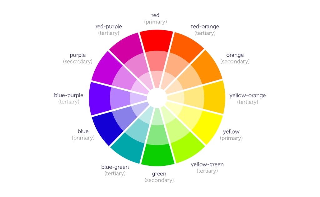
Colour theory involves the study of how colours interact, the emotions they evoke, and how they can be combined to create appealing visuals.
- Primary Colours: Red, blue, and yellow are the primary colours from which all other colours are derived.
- Secondary Colours: Green, orange, and purple are created by mixing primary colours.
- Tertiary Colours: These are combinations of primary and secondary colours.

Using Colours Effectively
To use colours effectively in your marketing materials, consider the following tips:
- Brand Colours: Choose colours that reflect your brand’s personality and values.
- Emotional Impact: Different colours evoke different emotions. For example, red can create a sense of urgency, while blue can evoke trust and calm.
- Contrast: Use contrasting colours to highlight important elements and draw attention.

Applying Colour Theory to Marketing Materials
Applying colour theory can enhance various marketing materials, including:
- Logos: Use colours that represent your brand and make your logo stand out.
- Website Design: Create a cohesive colour scheme that enhances the user experience.
- Print Materials: Use colours strategically in brochures, flyers, and business cards to attract attention and convey your message.
For more in-depth info, check out Hubspot’s article on colour psychology here.
Conclusion
Understanding and correctly applying colour theory can significantly enhance your brand presence, making your audience more engaged. At Aimero Agency, we help businesses use colour theory to create visually appealing and impactful marketing materials. Contact us today to learn more.


